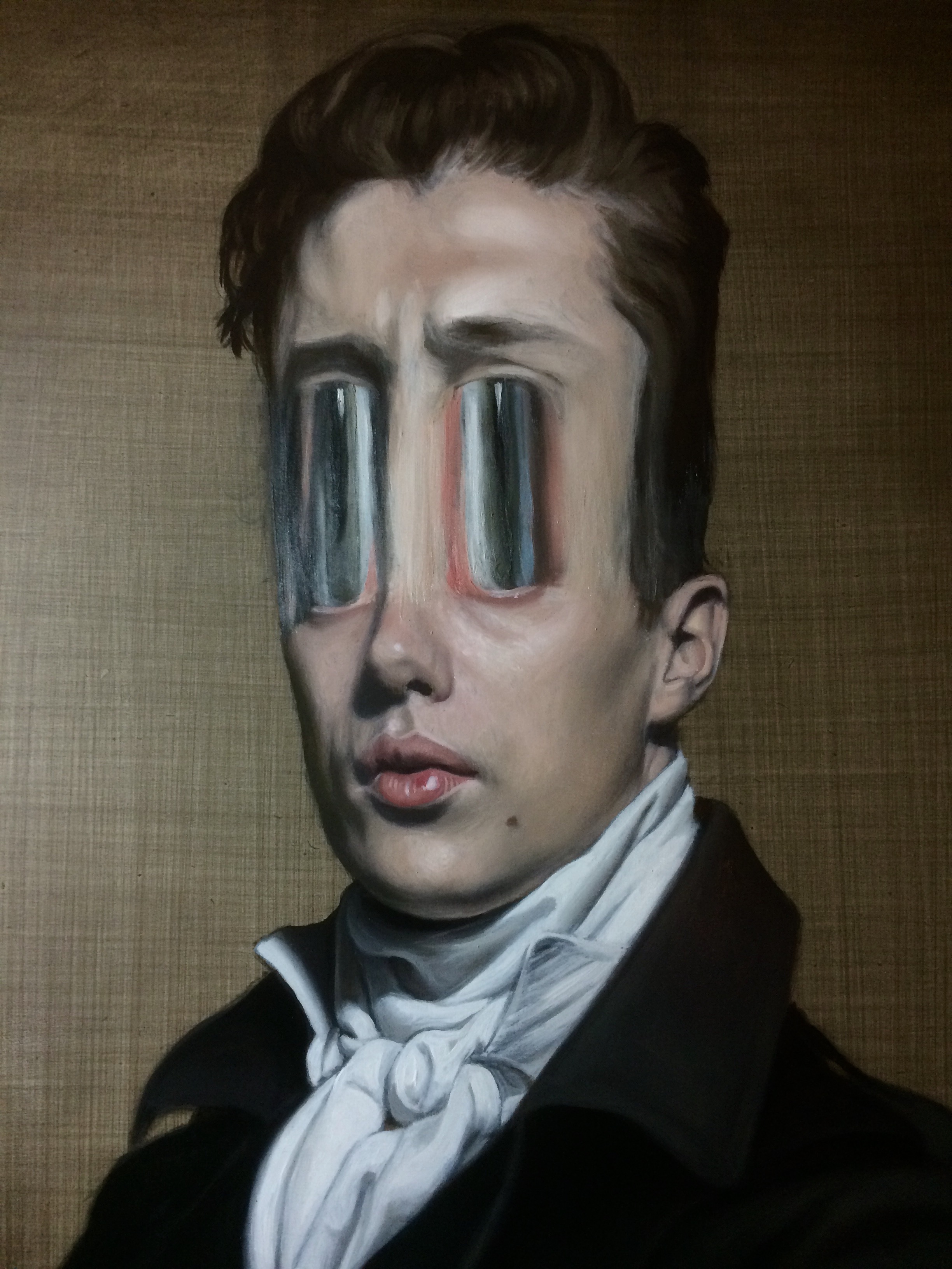
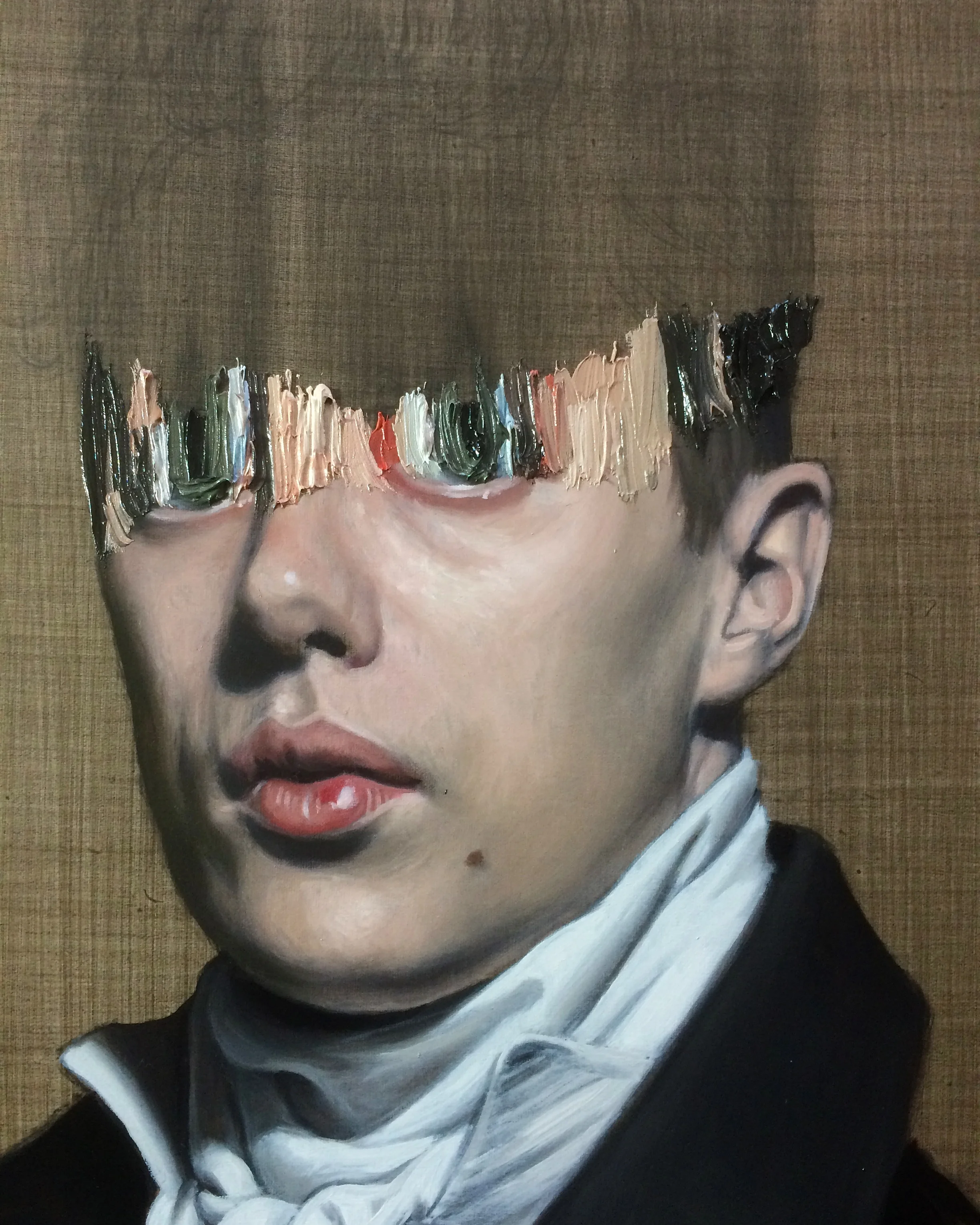
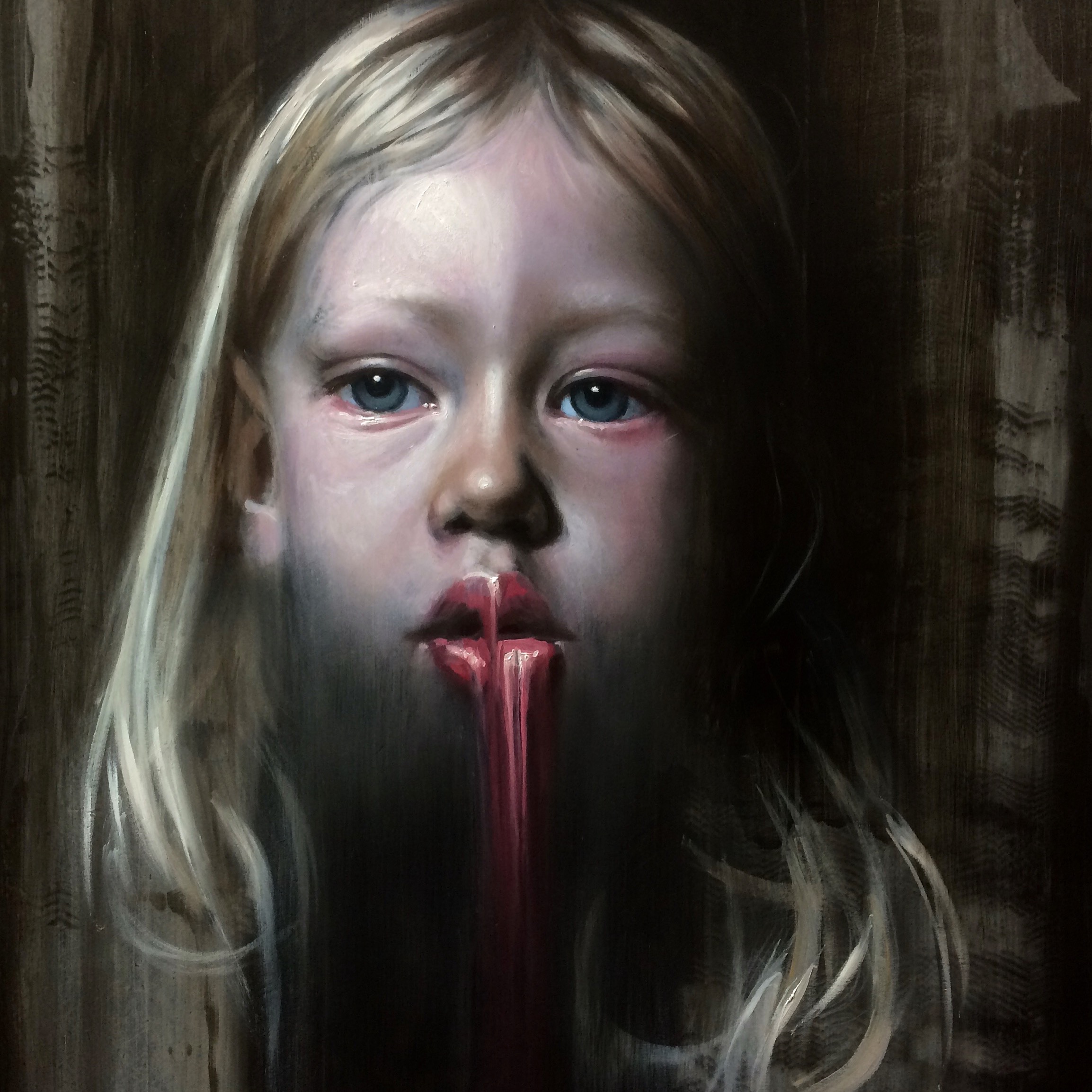
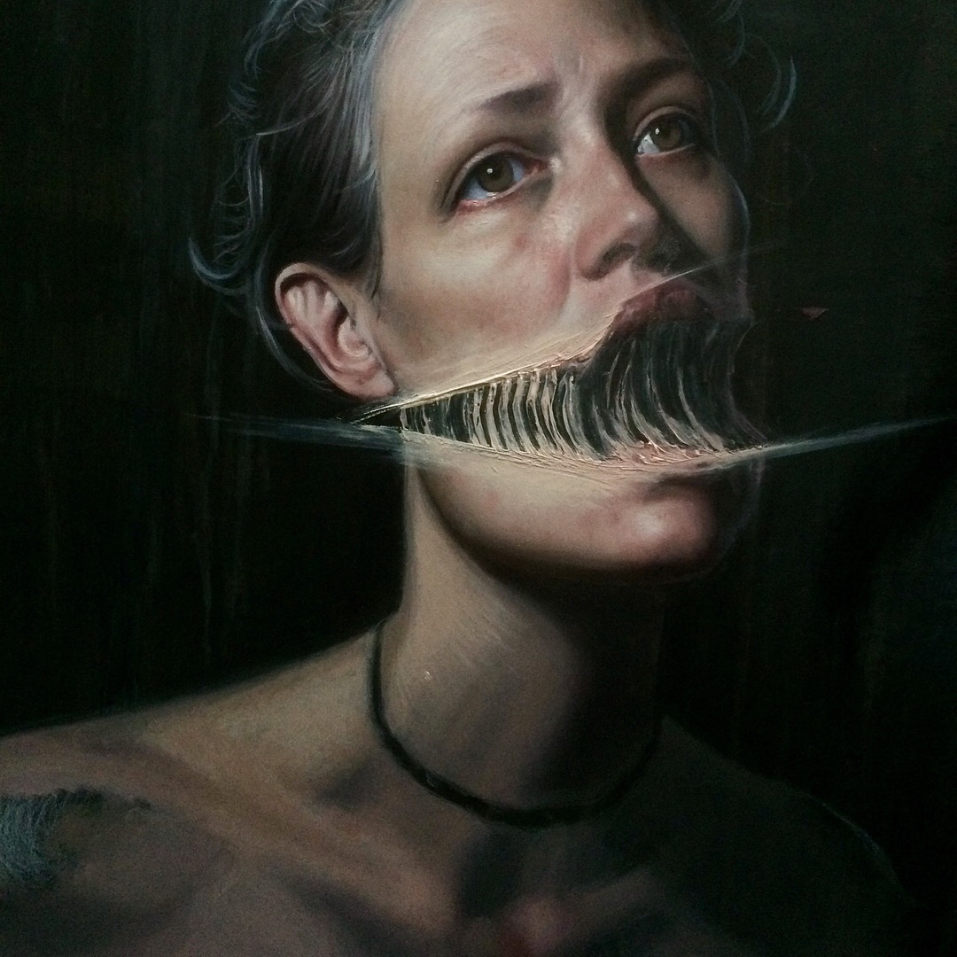
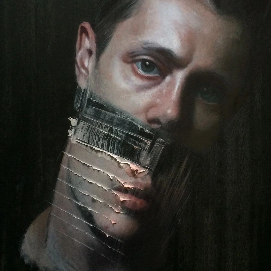
I have started a new series of Regency style paintings, my working title is 'As the Sun Sets on the Empire'. I am using the same paint dragging effect that I employed in my last painting of Hiero.
Pre and Post Drag
The Stretching of Hiero

Painting one Head

Stretching Hiero
This experiment was focused on dragging the paint from an incomplete head away from the painting. I am now using a palette knife or a silicone block to drag the paint and it gives a very different effect to a brush or finger.
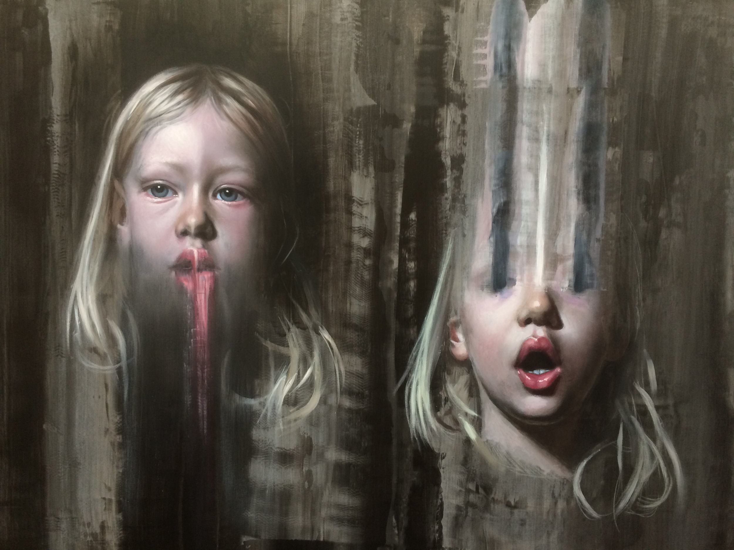
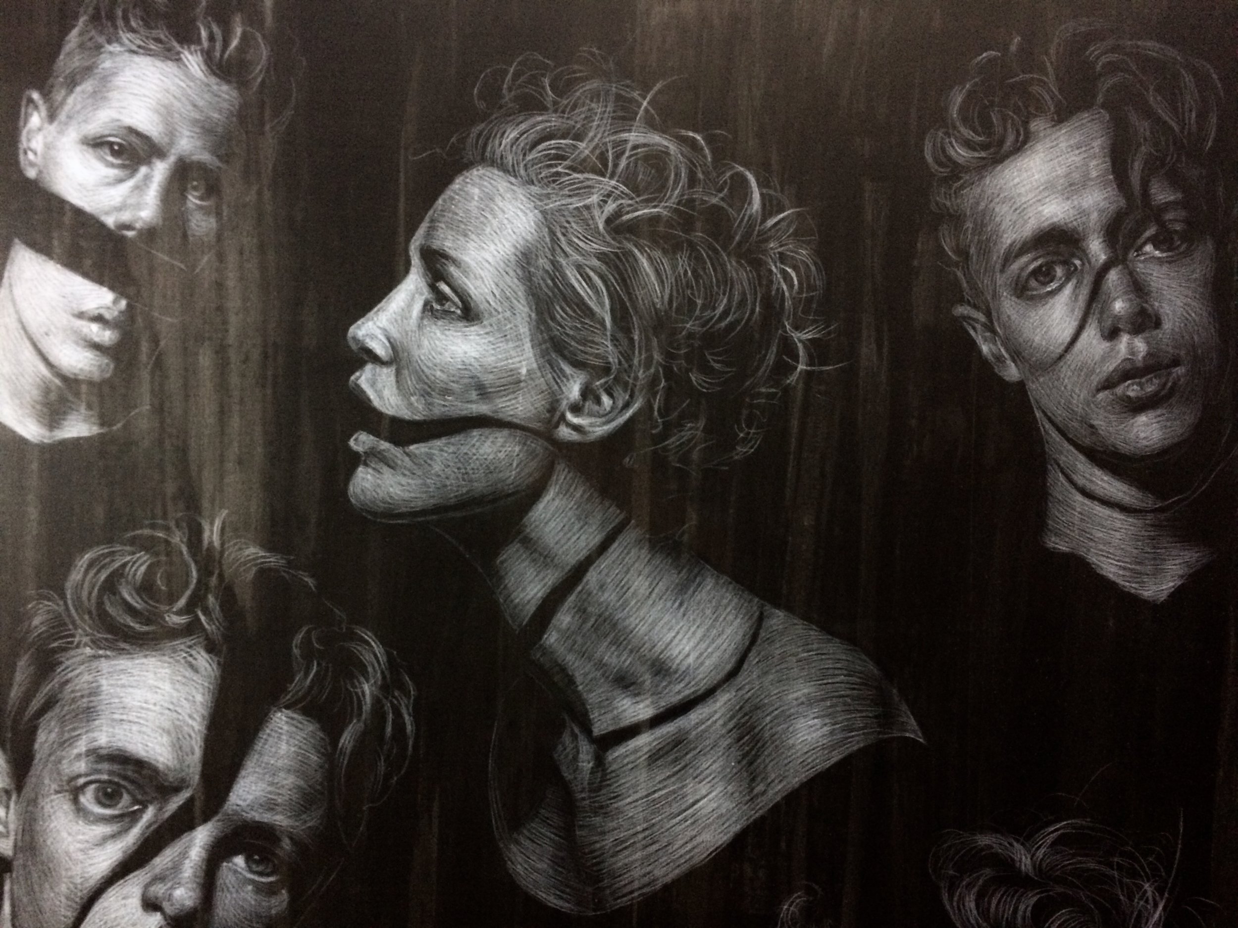
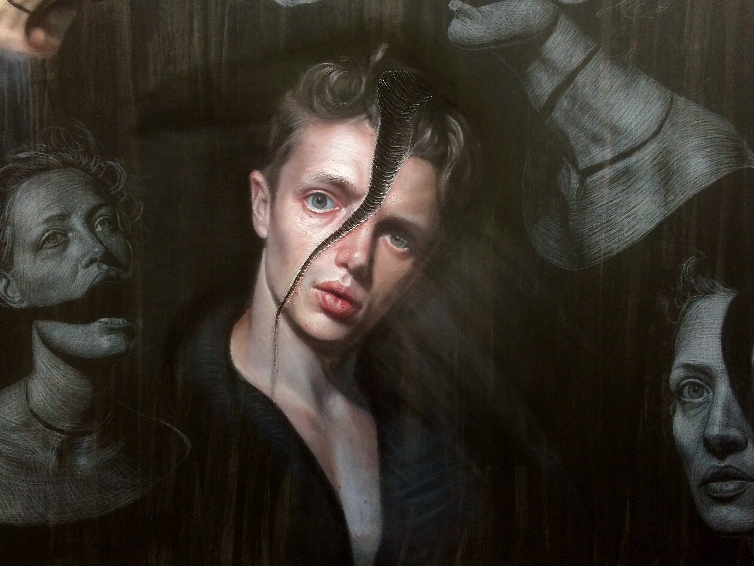
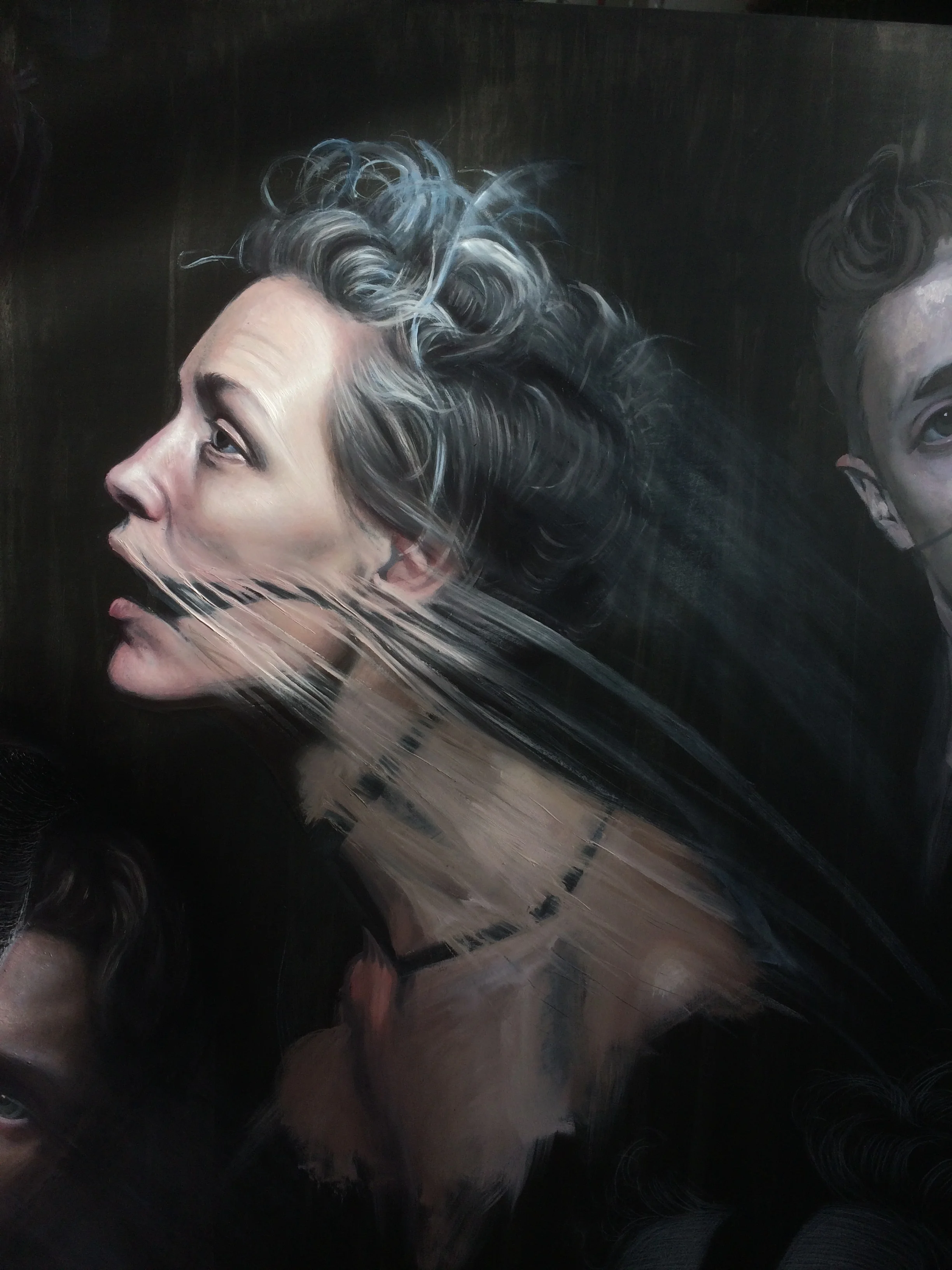
A Bunch of Fractured Heads
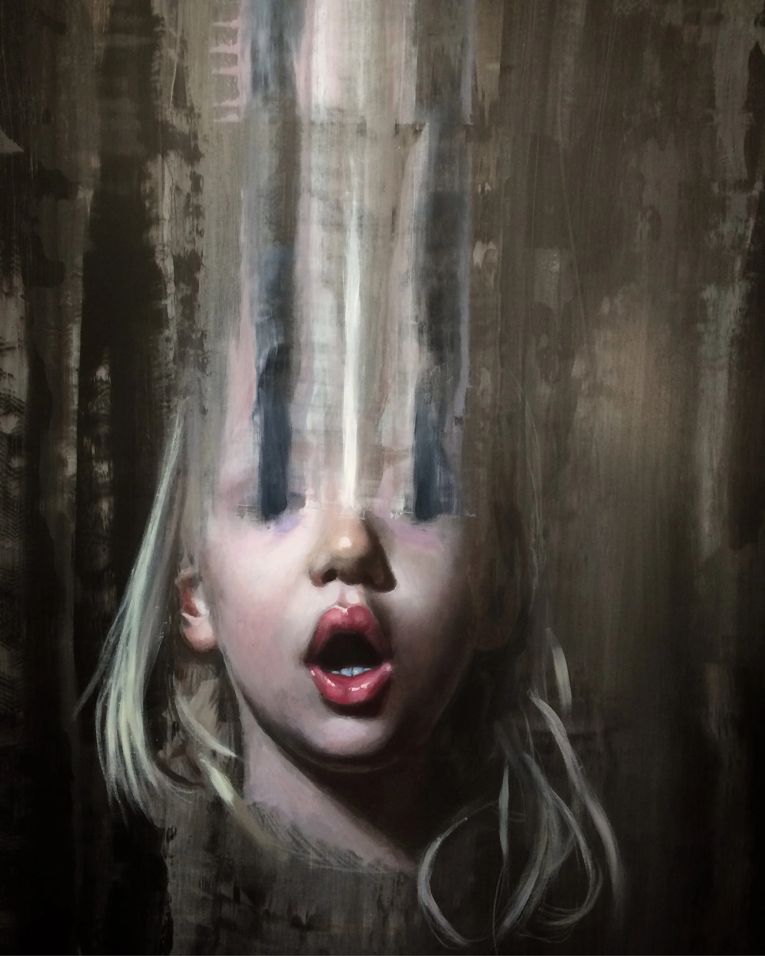
I decided that my work was looking a bit too polished so I thought I should fuck it up a bit. Instead of using my technique to mask the nature of the paint I use I decided to celebrate the viscosity of the medium. I wanted to fracture the portraits I paint, breaking them apart like tectonic plates with the oil oozing out of the space between.
I thought it would be a good idea to start a whole series of these heads on the same board, mainly because we are running out of room in the studio.
A little chat with Rory
Rory and I in conversation about the creation of his album artwork.
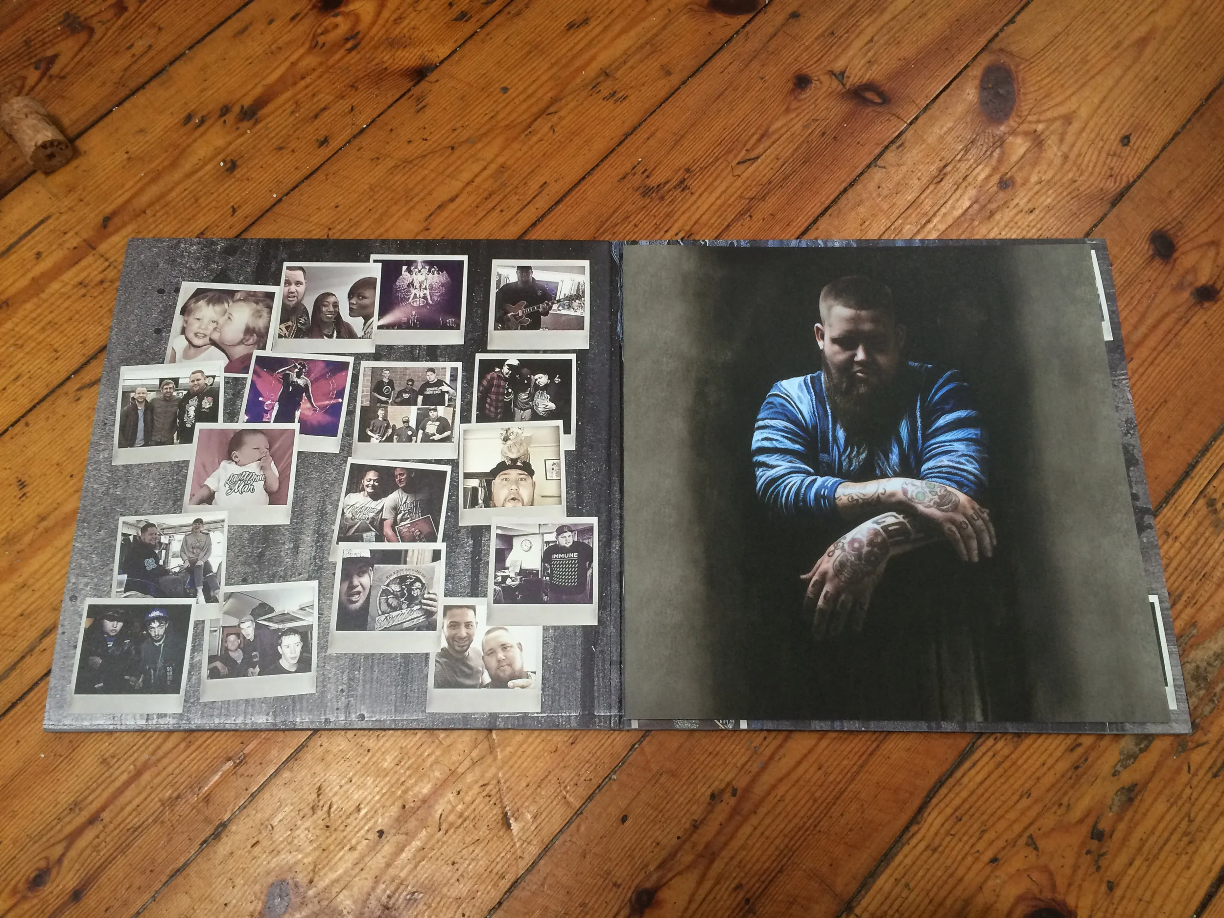
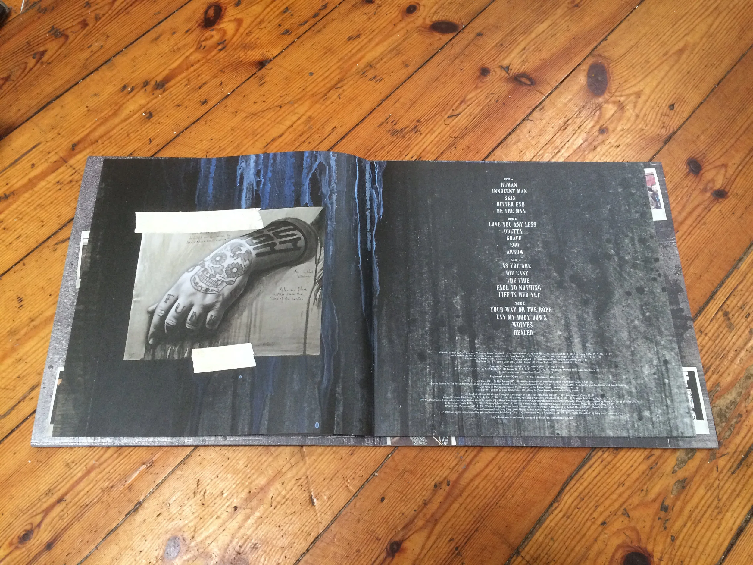
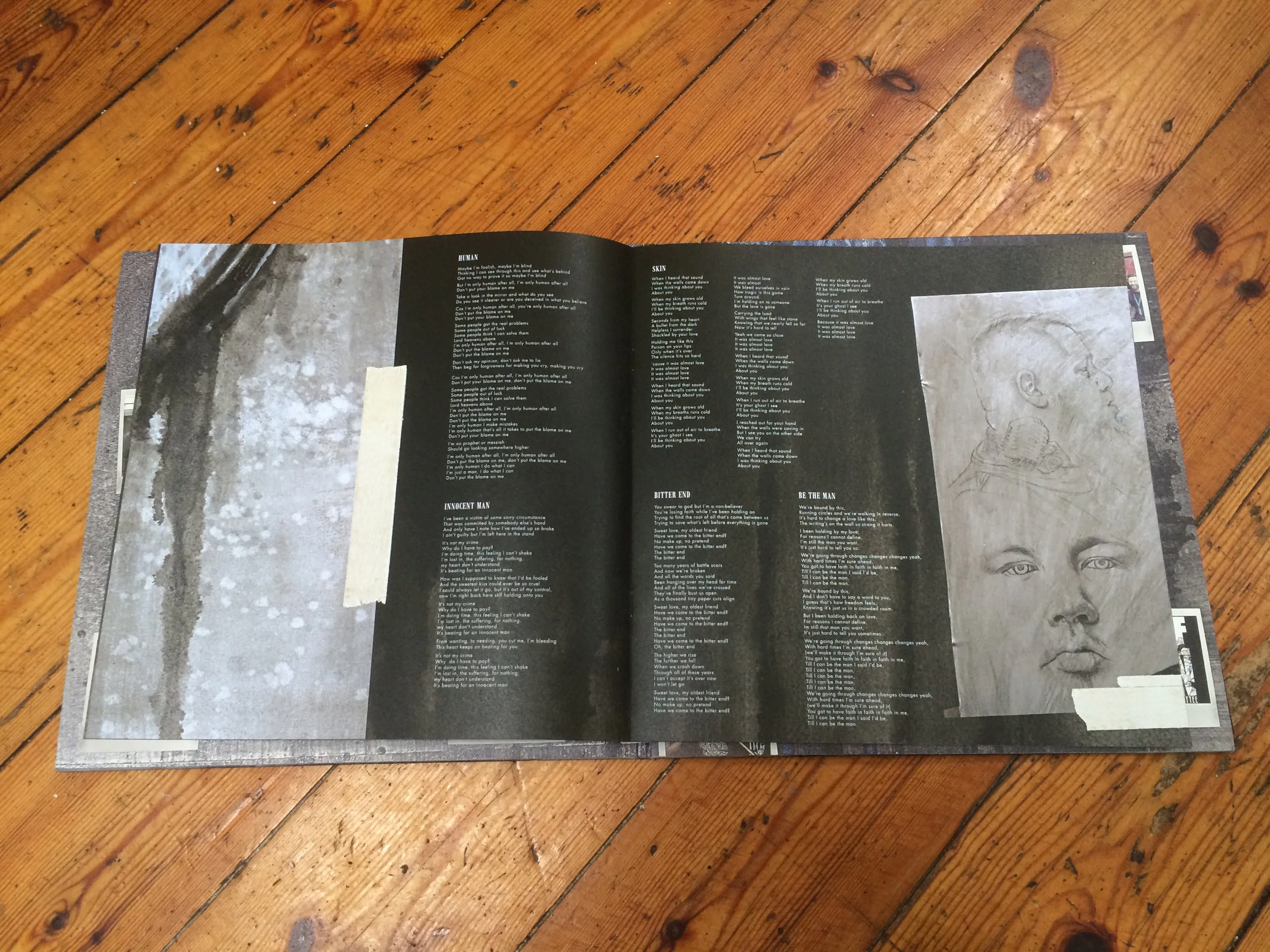
Rag'n'Bone Man Album Artwork
Finally the album has been released today! This project has been going on now for over a year and it's not even close to being finished, which is actually quite nice.
We have watched Rory's meteoric rise to fame with astonishment, it's like watching a family member succeed. He was on the Graham Norton show last night and it was quite surreal watching Norton hold up the artwork on national TV. We got copies of the vinyl and deluxe CD's through the post this morning and the painting was on the back of the NME yesterday, given out for free to the city's commuters.
After all the shows i've done and paintings sold, this is by far the best way of getting your work in front of as many people as possible, this whole music thing is working out rather well.

The album design was put together by Paul Chessell, I supplied him with preparatory oil sketches and process shots of the paintings to give people an insight into how the artwork was made. I really like the way he's used the drips in the background and masking tape around my drawings, it gives a great sense of tactility to a mass produced object.


TKIDLLTK in Lampoon Italia
// click the image to read the piece

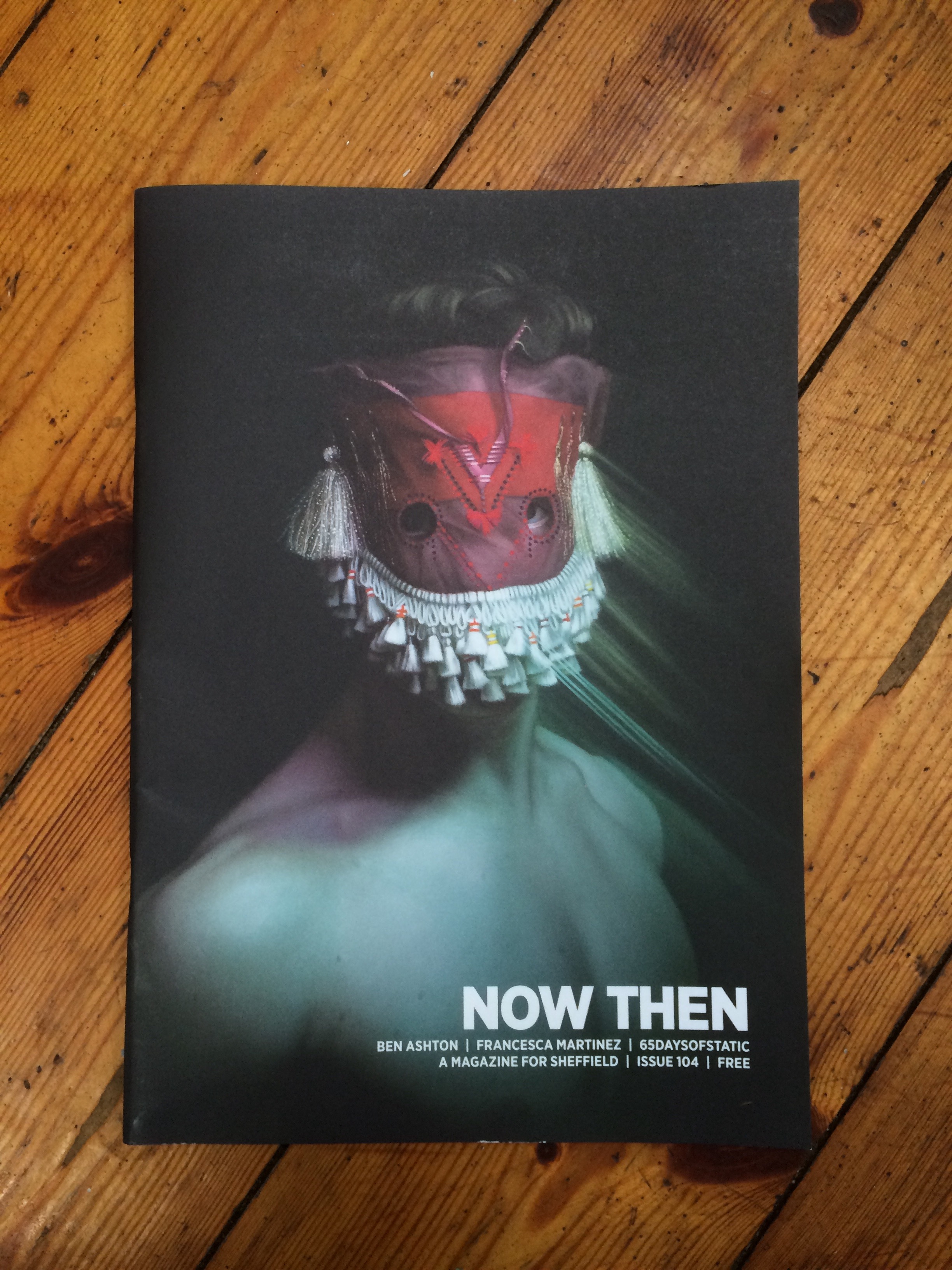
Now Then Magazine
Wylde Magazine
// click the image to read the piece

LONDNR on TKIDLLTK
// click the image to read the piece

PETrie on TKIDLLTK
// click the image to read the piece

PETrie Inventory - in conversation
// click the image to read the piece

Gilded Birds on The King is Dead, Long Live the King

Sightings of Rag n Bone Man 'Human' Posters
Extremely impressed with the media campaign for Human, these posters sprung up overnight all over the country. I love how they let the image speak for itself with very little written information, the mystery surrounding this campaign should draw the public in with curiosity. I'm very proud to be part of this project. Click the images to see them larger.


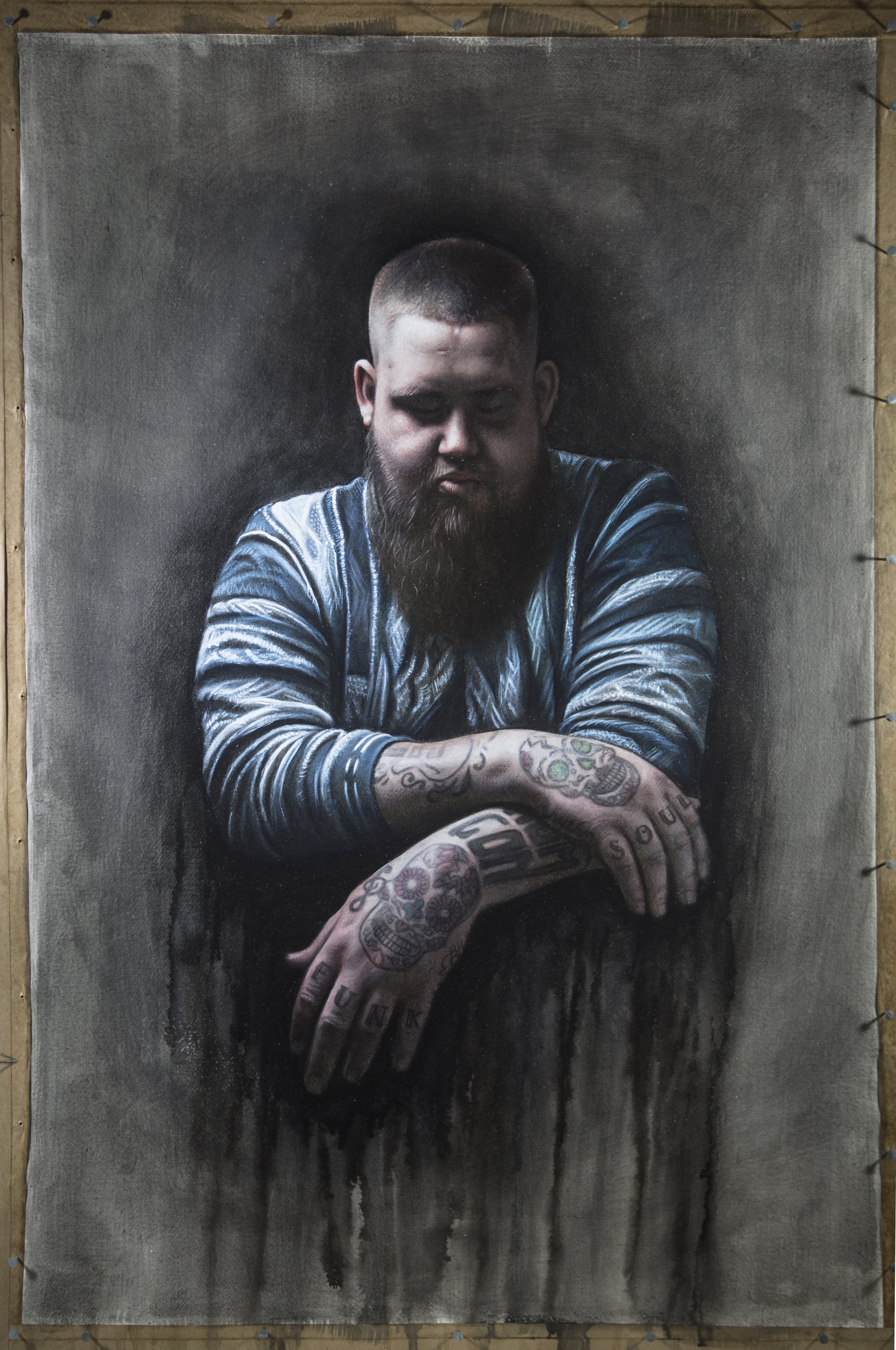
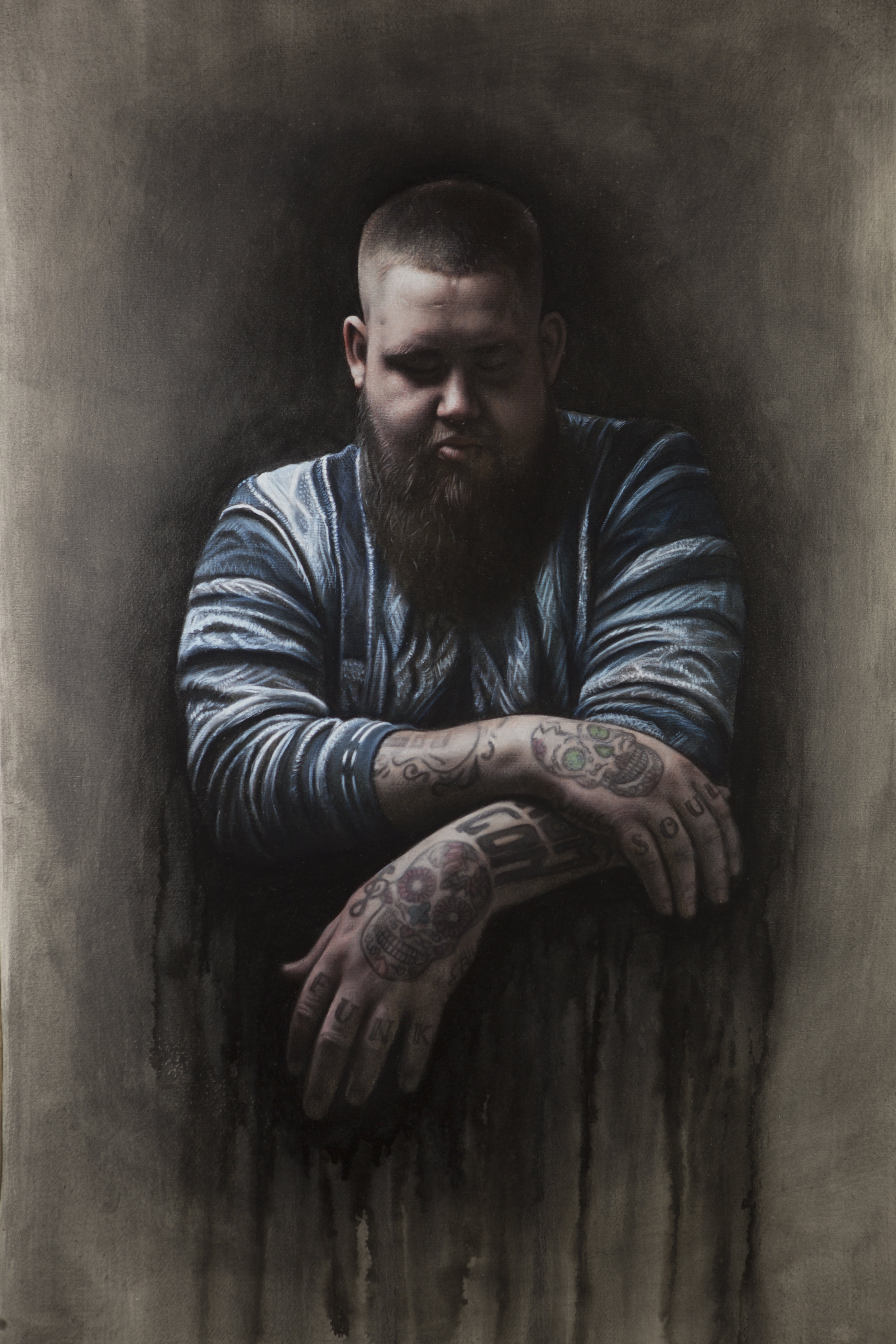
Rag n Bone Man and the painting of Human
I have recently been commissioned to paint an entire album campaign for the artist Rag n Bone Man. This will include 3 singles (so far) and an album, and the artwork will probably be available as merch, too.
The concept for the campaign is to slowly reveal Rory as the person behind the music, starting with his hands. I have always found painting tattooed skin challenging as the ink must appear to be under the skin and not painted on top...what fun!


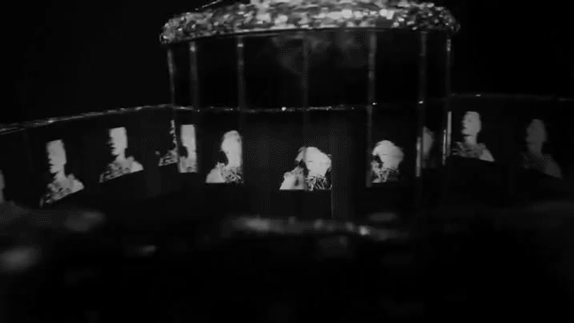
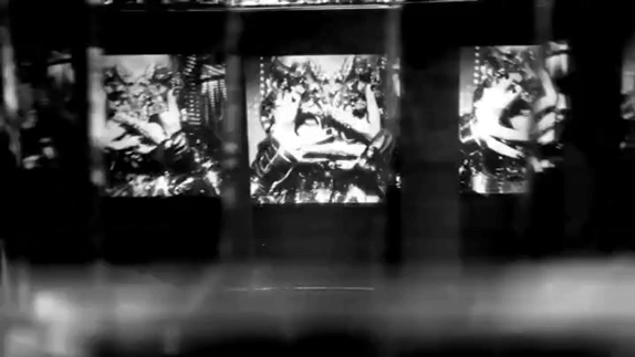
Daphne Guinness and the Praxinoscope
I created a Praxinoscope for our new music video for Daphne Guinness. The song had a noirish silent film vibe to it, so I felt harking back to the beginning of moving image seemed appropriate. A Praxinoscope is very similar to the better known Zoetrope, except instead of viewing the images through slits, you can see the moving image in a cylindrical formation of mirrors.

The making of the Praxinoscope
Making a spinning device was an interesting new challenge for me, I have made many optical sculptures in the past but none of them had to rotate. The main structure of it was made out of wood but the spinning base was achieved by bastardising the hub of a bicycle wheel. The next challenge was to figure out how many images/mirrors were needed in order to produce a smooth repeating moving image. I ended up choosing 18 separate images to create loops of Daphne repeating simple actions and this worked well.


The Many Layers of Goliath
I have passed the midway point with this painting and it's starting to feel like i'm getting somewhere. There are so many different variables when painting on glass in layers, one of the most annoying of them all is the fact that the glass has a greenish hue to it. The more layers you add, the more green it gets. This means you have to add more magenta glazes to the back panels to counteract the effect. I can't wait to add the final details to each pane.